Want to understand how your marketing channels work together? Cross-channel data visualization combines data from platforms like email, social media, and CRM into a single view, helping you make better decisions and improve marketing outcomes.
Key Benefits:
- Track the entire customer journey from start to finish.
- Measure ROI across channels for smarter resource allocation.
- Identify patterns, improve campaign timing, and focus on what works best.
How It Works:
- Connect Data Sources: Use APIs, ETL tools, and data warehouses to centralize information.
- Choose the Right Charts: Use bar charts for performance, funnel diagrams for journeys, and heat maps for geographic data.
- Apply Attribution Models: Understand channel contributions with first-touch, last-touch, or multi-touch models.
Tools to Use:
- Google Analytics 4: Event tracking and data-driven insights.
- Tableau/Power BI: Create interactive dashboards with real-time updates.
Pro Tip: Standardize metrics like conversion rates and ROAS, and build clear dashboards with consistent colors and live data for quick decisions.
This guide breaks down everything you need to know to start visualizing your cross-channel data effectively.
Core Elements of Data Visualization
Connecting Data Sources
Creating effective cross-channel data visualizations starts with properly linking diverse data sources. This requires building reliable data pipelines that preserve accuracy while combining information from multiple platforms.
A solid data integration setup usually includes these three components:
-
API Connections
APIs enable real-time data access and synchronization. For example, an email marketing platform can connect directly to a CRM system, allowing instant access to customer data. -
ETL Tools
Extract, Transform, Load (ETL) tools handle data processing. They pull raw data from various sources, standardize it into consistent formats, and load it into a central location for analysis. -
Data Warehouses
A data warehouse acts as a central hub, storing standardized data from all channels. This provides a single source of truth for visualization tools to pull from.
Once the data is integrated, the next step is selecting the right visualization formats.
Chart Types and Display Methods
Choosing the right visual format is crucial for clearly communicating insights. Here are some recommendations based on the type of data:
| Metric Type | Recommended Chart | Use Case |
|---|---|---|
| Channel Performance | Stacked Bar Charts | Compare contributions across channels |
| Customer Journey | Funnel Diagrams | Track conversion paths |
| Time-based Trends | Line Charts | Monitor performance over time |
| Geographic Data | Heat Maps | Visualize regional engagement |
| Attribution Data | Sankey Diagrams | Show multi-touch attribution flows |
Attribution Model Basics
Clarifying channel contributions requires using well-defined attribution models. Here are three common approaches:
- First-Touch Attribution: Credits the first channel that introduces a customer. Useful for evaluating initial awareness efforts.
- Last-Touch Attribution: Credits the final channel before conversion. Helps identify which channels close the deal.
- Multi-Touch Attribution: Distributes credit across all channels involved in the customer journey. Provides a more comprehensive view of channel performance.
When applying attribution models, keep these points in mind:
- Align the model with your specific business goals.
- Ensure consistent data collection across all channels.
- Regularly review and update attribution rules.
- Use clear visualizations to present attribution insights effectively.
Data Visualization Tools
Google Analytics 4

Google Analytics 4 (GA4) makes it easy to visualize cross-channel data using its built-in reporting tools. It includes event-based tracking, data-driven attribution, and customizable reports for deeper insights. Plus, its integration with BigQuery allows you to merge mobile and web interactions into a single, clear customer view.
Tableau and Power BI

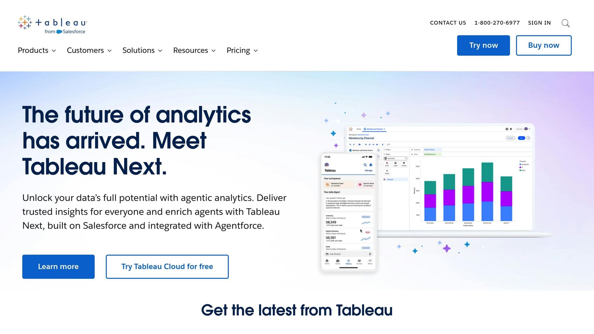
Tableau and Power BI provide interactive dashboards, connect to a wide range of data sources, and offer customizable visuals with real-time updates. These tools simplify combining data from multiple sources, helping businesses uncover actionable insights across channels. Once your data is in place, choosing the right email platform becomes the next step for seamless cross-channel visualization.
Choosing an Email Marketing Platform
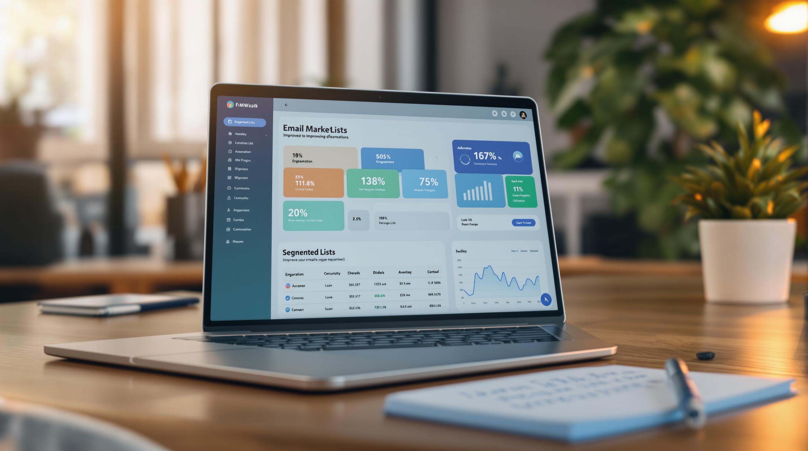
To achieve effective cross-channel visualization, your email marketing platform should include strong integration options, analytics dashboards, and cross-channel tracking. The Email Service Business Directory is a helpful resource for finding platforms that offer features like built-in analytics, API connectivity with popular visualization tools, data export options, and tracking across multiple channels.
sbb-itb-6e7333f
Data Visualization Guidelines
Setting Consistent Metrics
Use the same KPIs across all channels to ensure accurate and meaningful data visualization. Focus on metrics that align with your business goals, such as conversion rates, customer lifetime value (CLV), and return on ad spend (ROAS). For email campaigns and similar channels, stick to consistent metrics like click-through rates and conversion values.
Adopt a clear naming system for your metrics to avoid confusion. Use descriptive labels that everyone can understand. For example, instead of vague terms like "engagement rate", opt for specific metrics like "30-day active users" or "revenue per email subscriber."
Building Clear Dashboards
Once you've standardized your metrics, the next step is to create dashboards that deliver actionable insights. Follow these principles to structure your dashboard:
- Visual hierarchy: Place the most important metrics in the top-left corner, where viewers naturally start.
- Consistent colors: Use the same color scheme for related metrics across all channels.
- Provide context: Include benchmark data and historical trends to make comparisons more meaningful.
Keep your dashboard focused by limiting it to 5–7 key metrics. Add drill-down options for users who need more detailed information.
Live Data Management
Managing live data is essential for maintaining accuracy and delivering timely insights. Beyond static dashboards, live data ensures your team can make informed decisions quickly.
Set up real-time refresh intervals (every 5–15 minutes is common) and use automated validation checks to catch anomalies. Have backup systems in place to maintain stability and prevent disruptions.
When dealing with live cross-channel data, prioritize reliability over speed. It’s better to update every 15 minutes with accurate data than to risk errors with constant real-time updates. This approach ensures your data stays reliable while still supporting quick decision-making.
Creating Cross-Channel Visualizations in CJA
Next Steps
Now that you understand the basics of visualization, let’s explore its benefits and how to get started.
Key Benefits
Cross-channel data visualization brings all your marketing data together, making it easier to understand customer behavior across platforms. This clarity helps you make better decisions based on real insights.
How to Get Started
Follow these steps to kick things off:
-
Audit Your Data Sources
List all the marketing channels and data sources you rely on. Ensure your email marketing platform works seamlessly with your visualization tools. The Email Service Business Directory is a helpful resource for finding platforms with strong integration options. -
Choose the Right Visualization Tool
Pick a tool that fits your current data systems and supports your organization’s goals. -
Define Your Metrics
Establish metrics that align with your business objectives to track the effectiveness of your visualizations.


